I Tried Havenly and Loved It: Virtual Interior Design Review
I'm someone who can be really hesitant about services, so you know I am running to Google to find out real people's reviews. Because of that, I am SO ready to share my full honest experience and review with the interior design service, Havenly! This Havenly review will go through everything, from the first sketches to the fully rec-imagined primary bedroom. And the best part? It was actually so easy and a great time, making it what I think may be the best online interior design service out there.
Promo Code
When you finish reading this and you feel like this Havenly may be right for you, I have a promo code to help knock the cost a little! You can use the Havenly promo code SABRINA25 for 25% off Havenly’s online full & in-person design packages! Full transparency, I paid for my interior design package myself, and then reached out to the Havenly team for a promo code for you all because I loved it that much.
Why Use Havenly?
When Coley and I moved to San Francisco, I already knew I wanted to invest more in what our space looked like and include more of our personal style. Because of that, I was asking around on Instagram about affordable and professional interior designers, and someone sent me a message saying that Havenly was amazing! So I checked it out online, and honestly, the design process seemed good enough for me. And to reiterate, it was not a sponsored situation! I only got the promo code after I reached out and told them how much I loved the experience.
And if you’re anything like me, you probably thought that interior design services cost an arm and a leg and are only accessible to rich people. Well, I’m here to break that myth! Coley and I chose to do an online full package (we’ll get into the different options in a bit), and it only cost us $129 (I think we signed up when they were doing a sale which they do quite often) to redo our bedroom. That’s it! Honestly, it was a great way for us to get some interior design help without the hassle of having to find someone ourselves.
I hope this is helpful, and I can’t wait to hear your thoughts after we dive into the whole Havenly experience!
Havenly’sPricing
The first thing you need to do is figure out what type of service you want! They have three different options, and here’s the breakdown of them below with standard pricing.
Like I said above, we chose to do an online full and here’s why. We really didn’t need someone in-person helping us out, but I did really want to make sure that the room design we were looking at actually fit the room we were needing it for. Because of that, the 3D renderings and custom floor plan sold us.
But good news, this is just the standard pricing! I feel like Havenly has a lot of sales (like around holidays), and you can always use my code SABRINA25 for 25% off Havenly’s online full & in-person design packages! So that would take the online full down to around $149 and the in-person to $525.
Now that we have pricing out of the way, let’s get down to how it works. Obviously, I think it looks a little different depending on what price package you choose, but this is how it worked for us with our online full!
Choosing a Designer on Havenly
First things first, we had to pick a Havenly designer! I wanted to work with someone who felt confident in the vibe we were going with, which was an updated take on an English Country home. We picked a designer named Amy partially because it seemed like she had that design style that we were looking for, AND she was from Asheville, North Carolina (Coley’s home!).
The cool thing about Havenly is that they literally have designers from all over the world that you can choose from, and so many designers that specialize in different room profiles. For example, they have designers that specialize in modern style or guy's bedrooms (which my step-brother loved). Amy for us was just a good fit!
I went through a ton of portfolios before choosing Amy. We messaged for a bit so she kind of knew the vibe we were going for and how much we wanted to spend on furniture, and then it was time for the fun part: uploading inspo.
Uploading Inspiration + Measurements
This part made me so excited about getting our room together. I already had so much saved to my Pinterest mood board, so Coley and I started digging through and pulling out all the key images that we thought conveyed exactly what we were going for! Here’s a snippet of what we uploaded to the site.
As you can tell, there was a big blue and green color palette going on, with some wood elements that made it feel a little cozier and cabin-like. We could also add comments to point out the specific parts we loved of each inspo photo, to help with clearer guidance. I really loved a somewhat classic look with bed linen, soft neutrals, and natural light, and I think the pictures captured that. It was an easy way for our Havenly designer to get that initial feel of what we were looking for in our own space.
We also sent in photos of what our room looked like. We sent in a TON of measurements and let her know the exact square footage, and let our professional designer Amy know where there were doors in the room. Honestly, this was the most annoying part lol, but I had Coley do the bulk of this work. We actually are on the bigger side of apartment bedrooms, but I wanted to make sure if we moved, the design would fit small spaces if need be.
Three DesignIdeas
Amy was able to take our many inspo photos, and come up with three different bedroom concept boards for us! I put her mockups in a carousel for you below: blue hues, English countryside, and light + clean.
I'm not going to lie, I'm a little picky with interior design. I really dislike the very typical bedroom designs that feel generic and not personalized (for example, I knew in my bedroom I didn't want a gallery wall or fairy lights), so I wanted to make sure I sent a lot of feedback. I pretty much knew right away that the blue hues vibe was out (it was like WAY too much blue and I am not a huge velvet fan texturely), and English countryside was the winner. Even with these three ideas, she had individually linked each item she thought could fit the room profile! It was such a better way to see the price points she had for different items, and be able to see each piece of furniture on its own.
Two Concepts
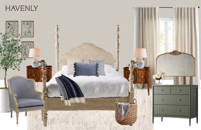
We went back to Amy with comments and all the things we loved/hated with each idea, and she came back with this concept board.
And guys, I LOVED IT. It was the perfect design. I immediately started looking through each item she had individually linked for us, and was seeing how much everything would cost. The only issue that came up was that this wooden four-poster bed literally cost SO much and was HUGE. While I loved the grandeur of it and it would have 100% been the focal point of the room, it really didn’t make sense in our small space apartment bedroom lol.
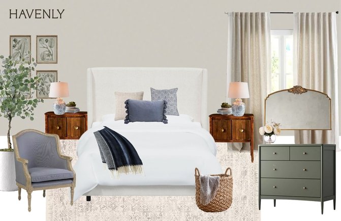
Because of that, we asked her for a neutral-colored bed, at a lower price point, that would allow our robot vacuum to clean under it. Quick enough, Amy came back with this mock-up up and we knew that she had hit the nail on the head. Also, I want to mention I was/am in love with these bedside tables! I had never seen anything like them, and it really helped bring the room feel together.
Designs
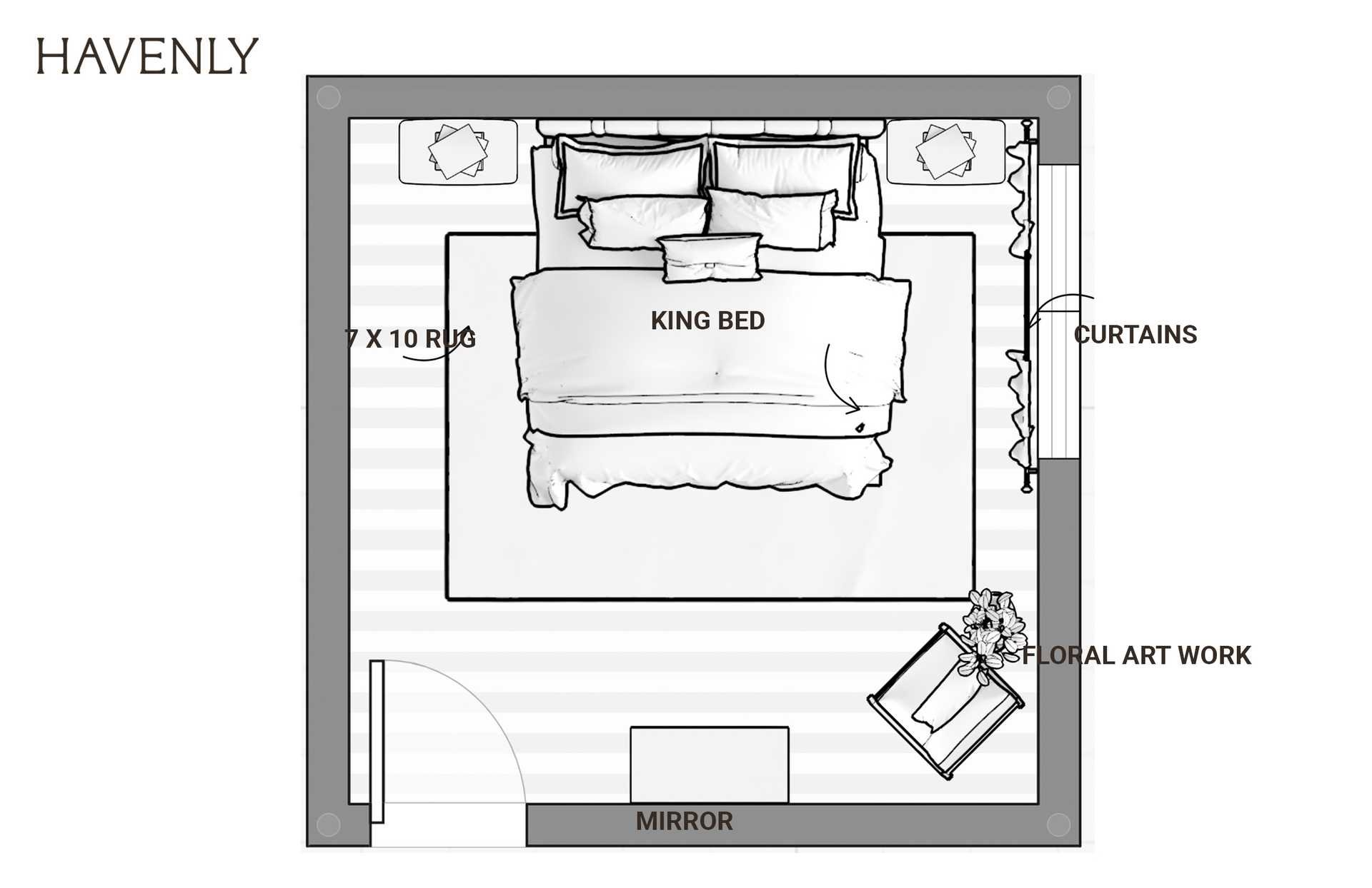
Okay, this is the part where the online full design package REALLY started being worth it. Now that Coley and I had let Amy know that we were all set with her final design of the primary bedroom featuring the white bed, she went ahead and did two different mock-up designs: one from a bird’s eye view and one in a 3D rendering format. This is what the final concept looked like!
The bird’s eye view was a nice reference photo to have, but what I was REALLY excited about was the 3D rendering. I LOVED how this all looked, and with this rendering, I was able to really start visualizing how it looked especially in our small bedroom. It really helped me visualize the color scheme, the different sizes of the furniture, and what wall art would look the best. I was fully obsessed with the final design concept!
Havenly Shopping Cart
Now that everything was finalized with Amy, it was time to actually start shopping! She put together a FULL curated shopping list with all the items in the photos below and items that could be used as good substitutes if something was out of stock or was too expensive. You can also shop all the items your designer puts together for you directly in Havenly, which probably makes life a little easier. You can shop all the items that I especially loved from the 3D rendering and design inspiration!
Havenly Design Brought to Life
Even though I love how easy Havenly makes shopping and the ordering process, Coley and I actually shopped each item at their respective sites, and got each piece of new furniture VERY slowly. We only did that because we didn’t have this huge budget to buy everything at once, and honestly, we made SOME tiny tweaks to the design. But the overall look we kept.
For example, we chose to do a piece of art above the bed that we both loved and had meaning (not something that just looked good), and we changed up the gold mirror since it was on backorder. We may or may not still get the chair, but right now we have Splash’s bed in that location! We also didn’t change to the sheer curtains since the curtain rods are kind of precarious in our room.
I feel like spaces are NEVER officially done when it comes to decorating for real life. You can always find something to add or change, and I feel that exact way with this bedroom. I loved Havenly because it gave me direction of where to even go with this empty space, and it’s been a wonderful jumping point for me and Coley. I loved playing creative director instead of head interior designer!
Is Havenly Worth it?
The short answer is yes, Havenly is 100% worth it. I truly love our bedroom now and it feels like a new place. It's the perfect place to relax after the end of a long day. I love our bedside tables, the warm and vibrant color palette, and the bed frame. I know our dog Splash is especially obsessed with the foot of the bed, he loves leaning up against it and taking naps. Truly if I owned a house, I would Havenly my home office, living room, and bathroom. The list would just keep going!
Using Havenly was truly such a great experience and they have something for everyone! It's a great idea if you're feeling stuck with your space. Going through the full process made a huge difference in my room, and it didn't take a lot of time to design.
I hope you found this helpful. Since designing our sleeping quarters, I've started a Havenly project on my guest bedroom at my dad's house! Maybe I'll share that experience too when I'm done. Don’t forget you can definitely use my Havenly promo code SABRINA25 for 25% off Havenly’s online full & in-person design packages. Happy designing!


